
This HTML code snippet helps you to change the background image on hover. It smoothly transitions between different images. This feature can be used inside web components to add interactive backgrounds.
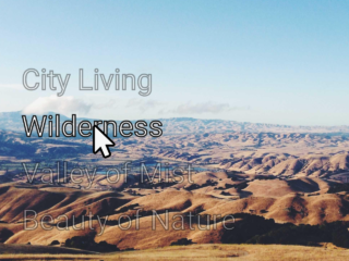
The figure element initially displays a background image defined in the CSS. Upon hovering over the figure element, a transition effect triggers, smoothly transitioning between different background images defined in keyframe animations. The :hover pseudo-class and keyframe animations specify the sequence and timing of background image changes.
How to Change Background Image on Hover Using HTML and CSS
1. First, create the HTML structure for the element you want to apply the hover effect to. In this example, we’ll use a <div> with a <figure> inside:
<!-- figure is the same size as the image. all images are the same size. Having different sized images fit into the figure will cause warping to the image upon the transition. -->

<div class="wrapper">
  <figure>
  </figure>
</div>
2. Next, add CSS styling to define the appearance and behavior of the element and its background images. Here’s the CSS code:
body{
/* fallback */
  background-color: #00563D;
  background-repeat: repeat-y;
  /* Safari 4-5, Chrome 1-9 */
  background: -webkit-gradient(linear, left top, right top, from(#00563D), to(#F7E611));

  /* Safari 5.1, Chrome 10+ */
  background: -webkit-linear-gradient(left, #F7E611, #00563D);

  /* Firefox 3.6+ */
  background: -moz-linear-gradient(left, #F7E611, #00563D);

  /* IE 10 */
  background: -ms-linear-gradient(left, #F7E611, #00563D);

  /* Opera 11.10+ */
  background: -o-linear-gradient(left, #F7E611, #00563D);

}

.wrapper{
  float:left;
  display:inline;
  border: 1px solid #ddd;

}

figure{
  width:  640px;
  height: 360px;
  overflow:hidden;
  background-image: url('https://source.unsplash.com/640x360/?girl');
  transition: all 1s ease-in-out;
  background-repeat: repeat-n;
  margin: 5px;
}


figure:hover{
  overflow:hidden;
  -webkit-animation: switch 5s infinite; /* Chrome, Safari, Opera */
    animation: switch 5s infinite;
   background-repeat: repeat-n;
}

@-webkit-keyframes switch {
    0% {background-image: url('https://source.unsplash.com/640x360/?rose');}
    20% {background-image: url('https://source.unsplash.com/640x360/?butterfly');}
    40% {background-image: url('https://source.unsplash.com/640x360/?laptop');}
    60% {background-image: url('https://source.unsplash.com/640x360/?tree');}
    80% {background-image: url('https://source.unsplash.com/640x360/?technology');}
    100% {background-image: url('https://source.unsplash.com/640x360/?makeup');}
}
Replace the placeholder URLs in the CSS with your desired image URLs. You can also adjust the transition duration and timing function to suit your preference.
Experiment with different background images and transition effects to achieve the desired visual impact. You can also adjust other CSS properties to customize the appearance of the element further.
That’s all! hopefully, you have successfully created a functionality to change the background image on hover. If you have any questions or suggestions, feel free to comment below.